Friday, 19 May 2023
Thursday, 18 May 2023
Monday, 15 May 2023
Plan
Plan for my magazine
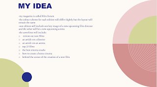
Since the audience prefer independent to mainstream films I am going to take most of my inspiration from the Sight and Sound magazine. One edition will feature a new upcoming film director as the key image and the other edition with a famous actor from a new upcoming independent film.
The colour scheme for each magazine will differ dependent on the key image and content being covered, but the layout will mostly remain the same. This includes: the masthead large and in bold across the top, one key image either mid shot or close up, the lead story with a headline at the bottom and minimal cover lines along the side. Each edition will use the same fonts to remain consistent.
The magazine will be called Film forum and will follow the typical content found in film magazines. For example some of the possible content it will include is:
- reviews on new films
- an article on a director
- an article on an actress
- top 25 films
- the best cinema snacks
- how to create a home cinema
- behind the scenes of the creation of a new film
Summation of findings
Summation of findings
Overall during my research, I have explored more in depth about the genre of film magazines and what they usually include. Film magazines tend to target a niche audience of film enthusiasts but have to feature films that appeal to film enthusiasts as a whole. This is especially for the film featuring on the front page, whereas inside they can feature more undercover independent films. Film magazines are known to feature big blockbuster films opposed to smaller films made by unknown production companies. Film magazines try to include as up to date information on the latest films, actors/actresses and directors. The mastheads of film magazines are large, bold and sometimes obscured by the key image, this is mainly on magazines with a large popularity because the audience are still aware of the brand name and don't need to see the whole masthead to recognise it. The front pages include iconography of films included inside the magazine, this helps create a link with the front page and the film featured, and if the audience recognises it can persuade them to buy the magazine to read more. A skyline typically features at the very top of the magazine cover and for film magazines may promote the release of a new film. Puffs are often featured as bubbles or shapes with information that gains the readers attention, the shape and colour compliments the rest of the images and may link to the main film featured. For example, if it was Spider-man, it may be shaped like a web. they include a range of information, such as how to win free prizes and other incentives.
Brands that produce film magazines implement conventions that differ from each other. EMPIRE magazine typically includes a big blockbuster film on the front page. These tend to be films from big chain companies such as the marvel series. Sight and Sound magazine has a more eclectic approach to its front page. It doesn't always cover a film as its key image, they also include film directors. Even when featuring films, the images aren't as maximal and extreme. The images are more intimate and refined. The house style of Sight and Sound magazine can't necessarily be described as consistent like EMPIRE can be. In comparison, Total Film magazine is more similar to EMPIRE and implements the same conventions. The key images are bold and 'in your face' and of a well known mainstream blockbuster films. They are not so much exclusively chain films but are still very well-known.
The audience is 16-25 year old middle and upmarket media literate. Being born in the digital age means they are up to date with using social media so the brand can converge over multiple media platforms to reach a broader audience. The middle class have more disposable income and are willing to pay more for a product of good quality. Media literate assumes that the audience are well-educated and knowledgeable of media forms.
Thursday, 11 May 2023
Case study- total film
Case study- total film
Total Film is a British magazine predominantly based exclusively on films. The issues include a range of features including, upcoming films and their synopsis, spotlight interviews from famous actors and actresses as well as directors. Total Film magazine's target reader is an 18-24 predominantly male cinema enthusiast.The film magazine has the cover price of £3.99.Case study- sight and sound
Case study- sight and sound
Sight and sound is an international film magazine which focuses mainly on independent films but does feature worldwide blockbuster films as well. The target audience is well-educated and those interested in film. Also, typically the readers are middle-class males 35+. The price of the magazine is from £3-£4.
Case study- EMPIRE
Case study- EMPIRE
EMPIRE film magazine's audience is 3/4 male, the average age of 40 and more in the AB socio-economic group. A year's subscription to this magazine costs £49.99.
-
After printing off my previous design of contents page, I realised the image of the girl on the right looked too big in proportion to everyt...


.png)
.png)
.png)


